2026
Design system
A simple design system implemented with Base UI.Table of Contents
Introduction
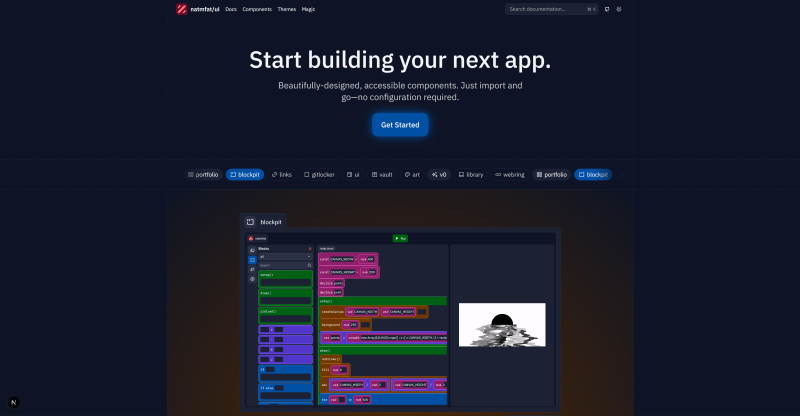
My refreshed design system, built with CSS Modules and Base UI. It's finally here. My personal design system, now open sourced. Documentation is still a work in progress, and it's not well-tested (yet). However, I've learned a lot buildingnatmfat@koide-labs/ui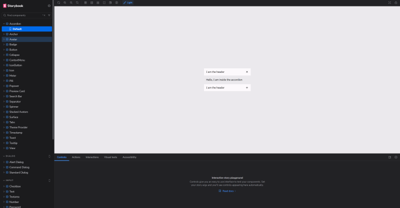 It even has a fully featured Storybook!
What have I learned?
How to write better code. Probably.Radix primitives are dead
Unfortunately, I just don't see a whole lot of activity behind Radix. Yes, Radix still has a lot of momentum and traction - in part, I suspect, because shadcn/ui keeps building on it. However, the library hasn't received many updates despite a growing numbr of issues. It's simply not as robust and not well maintained. Additionally, there are some architectural differences between Radix and Base UI that make some things impossible - such as enter and exit transitions. Base UI is committed to making a "future-proof foundation", and even has a dedicated full-time team. I'm optimistic Base UI won't face the same (immediate) fate as Radix. Naturally, building my UI library on the corpse of another was a very unappealing prospect. Since evaluating my options, I decided to rewrite the entirety ofnatmfat@koide-labs/uiCSS Modules are still better
In my previous write up on my portfolio, I outlined a somewhat confusing scheme of using Class Variance Authority (CVA) to define variants for components, CSS layers to override already defined styles, and then heavily leaning on composition for everything - including applying styles to components. When I had the opportunity to rewrite everything from the ground up, I realized that all of that is basically useless and just creates more work for little benefit. I immediately ditched it all and used CSS Modules for everything. CSS Modules support dynamic class names, so we can just reuse any variants passed as props. I'm sure there's some benefit to using CVA, but it just feels overengineered and too complicated for a relatively simple problem. I ended up using a Typescript plugin for CSS Modules for "end to end" typesafety across the styles and props defined in TypeScript. Unfortunately, while this approach is not without its own drawbacks (plugins are not supported at build time, so it's just for IntelliSense), it's good enough for my purposes.By definition, CSS Modules are isolated and the last class has maximum precedence, so layers are practically useless. I removed them without too much effort. Composition, when used too frequently, sucks. Previously, I used components to apply styles:import styles from "./index.module.css"; type Variant = "sm" | "md" | "lg"; export function Component({ variant = "md" }: { variant: Variant }) { // at least VSCode will complain if the variant doesn't exist // even if it's not enforced at build-time return <div className={styles[`variant_${props.variant}`]}></div> } // as opposed to something like this: const variants = cva(styles.base, { variants: { size: { sm: styles["variant_sm"], md: styles["variant_md"], lg: styles["variant_lg"] } }, defaultVariants: { size: "md" } })
But this is verbose and can easily cause conflicts or confusion depending on the order in which the components are nested. Does<Interactive> <Colorway color="primary" variant="fill-outline"> <Loading> <button></button> </Loading> </Colorway> </Interactive>
InteractiveColorwayView<View render={<button />} interactive="primary_fill-outline" loading></View> /* under the hood, we have something like this: <div className={clsx( interactive && styles["interactive"], colorway && styles[`colorway_variant_${colorway}`], loading && styles["loading"] )}></div> */
Composition sucks
Yes, only in some cases. When you need unstyled primitive components, composition is amazing because it's infinitely more customizable than a long list ofprops- It's unwieldly to use and difficult to read because it's mind numbingly repetitive
- It allows behaviors that shouldn't be possible in the first place.
It's simply too verbose. Perhaps in an era where code is cheap, this actually makes sense because the LLM will have a greater understanding of the context and purpose behind each component. But as a human, typing and reading that sucks. Additionally, using props allows you to easily enforce certain behaviors, such as an icon can only go on the left of a<ContextMenuRoot> <ContextMenuTrigger></ContextMenuTrigger> <ContextMenuPortal> <ContextMenuPositioner> <ContextMenuPopup> <ContextMenuItem /> </ContextMenuPopup> </ContextMenuPositioner> </ContextMenuPortal> </ContextMenuRoot>
ButtonDialogRewriting presents opportunity
Tearing it all down and starting anew is honestly a terrible idea, and not a decision you can make for most complex software projects. However, rewriting everything from the ground up is somewhat appealing because it enables you to make major stylistic (such as component names) and architectural (such as using Base UI instead of Radix) changes. Additionally, you've most likely identified several pain points by using the old project, some of which cannot be fixed without a major overhaul. Sometimes, issues just accumulate because of technically working "temporary" measures and TODOs that get strapped together and then promptly forgotten. Rewriting presents a great opportunity to get things right the first time. You can easily enforce a higher standard of code quality right from the beginning. For@koide-labs/uiChallenges
Rewriting my old UI library was mainly just tedious. Base UI intentionally made the API very similar to Radix, which already was very consistent and easy to understand. So the underlying framework wasn't that hard to port over. I did make some design choices that did require refactoring across the board (namely usingViewInteractiveColorwaycmdk
I did recall a pretty significant challenge though - integratingcmdkcmdkcmdk-headingdata-disabledcmdkdata-disableddata-disabledTurns out.interactive:not([disabled], [data-disabled]) { /* idk this is just an example */ }
cmdkdata-disabledtruefalse[data-disabled="true"]Icons
Previously, I had a custom build script that would traverse a directory of SVGs (sourced from Remix Icon) and then generate a corresponding React component. This approach was inherently very fragile and tedious to update (I would have to manually include that directory and then run the script). I realized I could just installremixiconremixiconremixiconWhen you build this in library mode, Vite will inline the asset as a big nasty string. I initially thought this would be okay. Just let the bundler handle everything. Turns out, that's no good. You can't load fromimport spriteMap from "./path.svg";
data:image/svg+xmlWhat does that even mean? I have no idea. Probably some security policy. A potential solution occured to me - I'm using vite-plugin-lib-inject-css, which preserves the CSS import statements. So why not just preserve the image import statement, thereby bypassing the entire "you can't load from this url" problem? However, a quick read through the plugin source code quickly revealed that their approach was only applicable to CSS, not any generic file. I was banging my head against the wall for a while. And then it came to me: just makeunsafe attempt to load URL <URL> from frame with URL <URL>. Domains, protocols and ports must match. can't load data:image...
remixiconremixicon@koide-labs/ui